The other night I got on my bike and rode deep into the forest to do some shooting at an enclosure named Ulvedalen. Ulvedalen translates to Wolf Valley, which sounds dramatic, but there really are no wolves. I don't know if there ever were. In return, there are foxes... or rather, their gloves. Foxgloves. The most magical clearings full of purple and white foxgloves. This was absolutely delightful for a photographer. I unfolded my tripod and got to work, thinking these images would be stellar.
They were not.
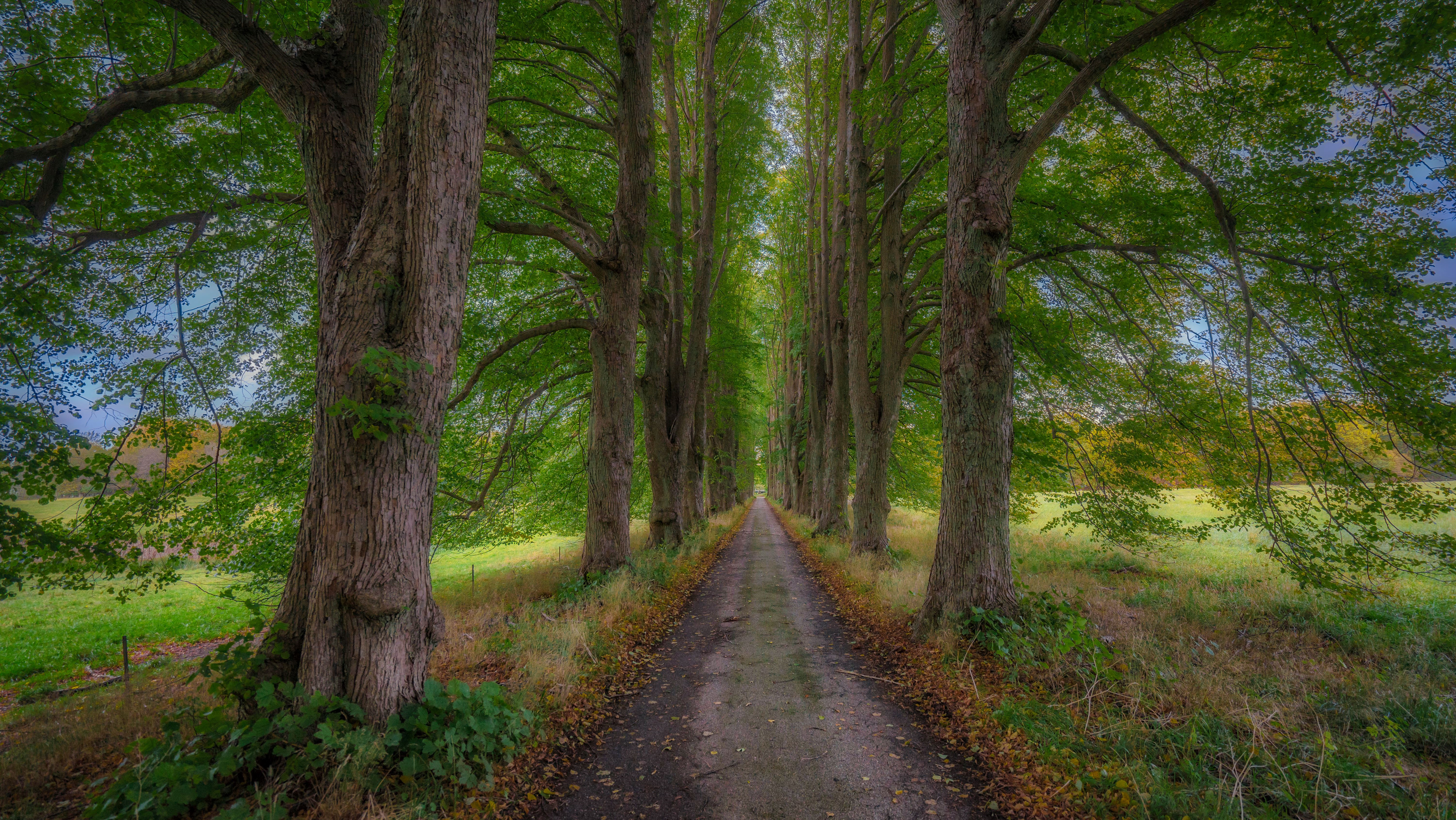
This is what one of the better images looked like straight out of the camera:
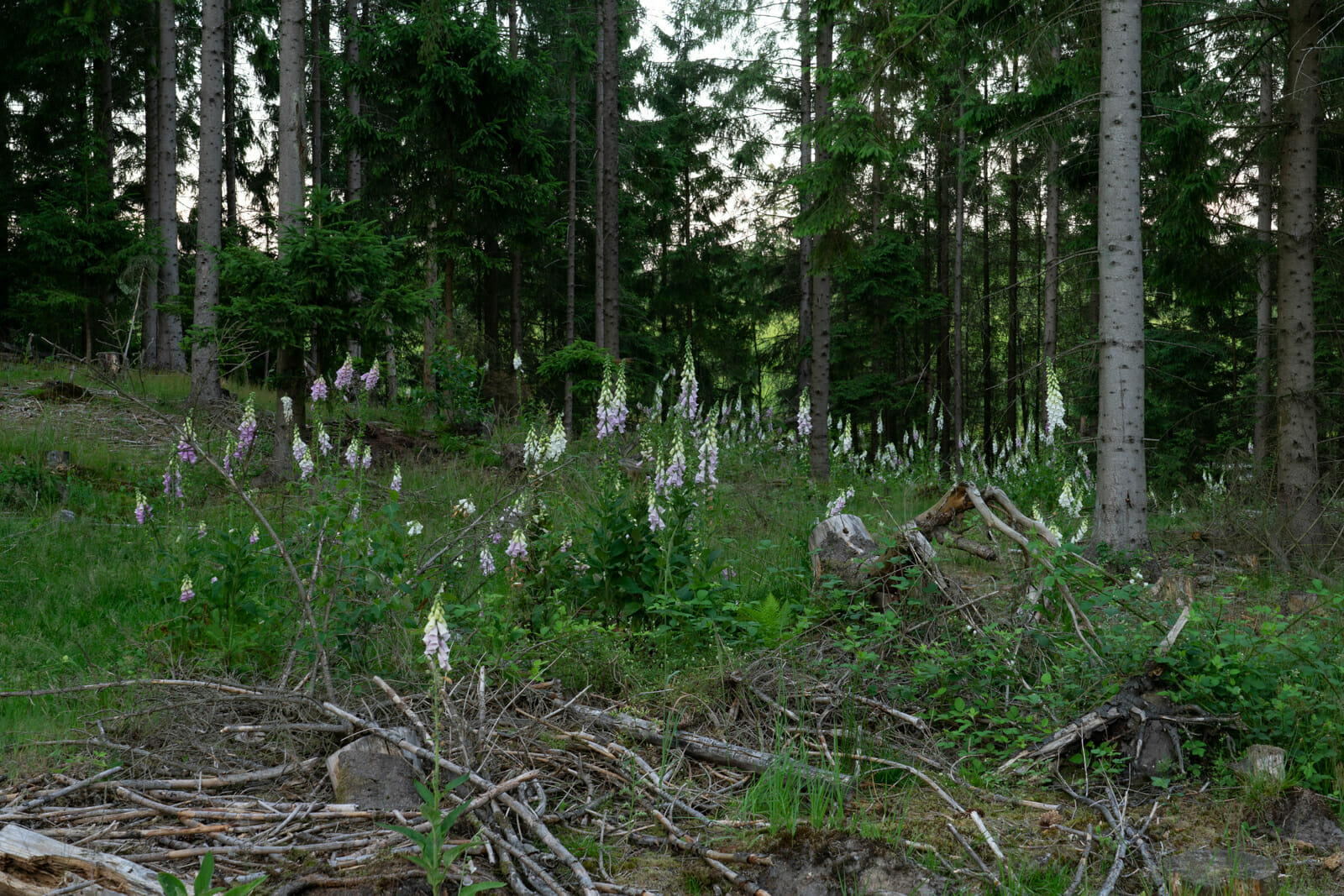
Now, there's nothing unusual about a RAW image looking less than amazing without at least a few enhancements, but this? What a horrendous mess! Looks like someone sprayed youghurt on the camera lens.
I was not pleased and almost marked it "Rejected". This was nothing like I remembered the scene. Where was the magic that I had felt when I was standing there? The whole scene had been so spellbinding that even the risk of having to ride my bike home through a pitch dark, unknown forest hadn't been enough for me to quit shooting. And now it looked like it had all been for nothing. Not even my usual arsenal of post-processing tricks did anything to improve things. I needed to completely rethink my editing in order to save this disaster.
Well, the first thing the image needed was a good cropping. The center of the image actually hid a pretty good composition, with the curved leading line of foxgloves disappearing into the background. In return, all the dead branches that, on the scene, I'd thought constituted a wonderful foreground had to go. Not so with the tree stub on the right and the thick branches coming out of the ground like some creepy forest monster. Those work really well as a contrast to the pretty flowers.
Thinking back on the scene, I remembered it as being much darker and with the foxgloves drawing all the attention like little, colorful lanterns. That's what I needed to recreate. The background behind the trees, in particular, needed to be all but eliminated with some serious darkening. In fact, everything in between the foxgloves needed to be darker and much more contrasty to the bright foxgloves. Plenty of Orton effect in Luminar and darkening brushes in Lightroom were among the tools I used to ensure that. The foxgloves themselves, which I remembered as being very purple and beautiful, and not the rather pale shade of the RAW image, also needed lots of work. I not only saturated them, but also brightened them - to make them seem almost glowing - with a tool I hadn't used much before: Color Efex Pro, which is part of the old Nik tools collection.
Finally, in order to make the image less messy, I had to remove several stray foxgloves here and there. Same thing with a few branches that were working against the general front-to-back direction of the image. This is the final result:
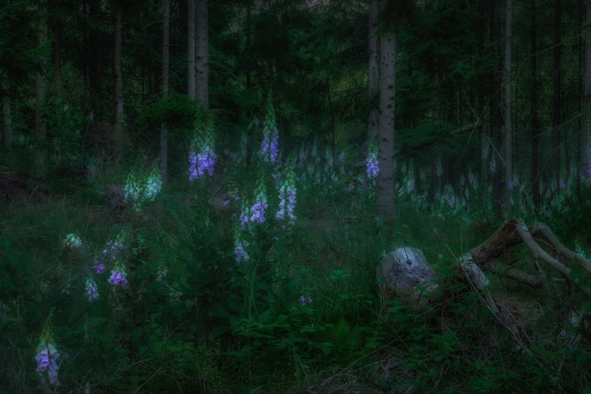
Phew... it's been a long time since I worked this hard on one image, but I really wanted a reminder of that beautiful evening. And I think I managed that quite well. It's quickly becoming one of my favorite shots of the month of June. For me it's a great example of the difference between what the camera sees and records and what your brain remembers.
The above image may not be how it actually looked and what was captured by the camera lens, but, by God, it is much closer to what I felt while standing there. And to me, that counts above everything else. So let this also be an illustration of 1) how I do not have any ethics when it comes to how much you are "allowed" to change an image in order to make it look the way you want it to - none.- and 2) apparently I do not have the photographic skills to make an image look right coming out of the camera. I rely a lot on my post-processing skills.
Do I have a problem with that? No. Does that make me less of an artist? Some would say yes. I choose to say no. (Not that I necessarily am one to begin with, but that's another discussion.)
It started back in August at a birthday party for my brother and niece. Out of nowhere my brother hands me a piece of paper stating that he and his girlfriend won't be buying me any birthday or Christmas presents for the next several years. I'm like, "What's happening? It has to be some kind of joke, except, I don't get it."
Then, after a few minutes, he hands me a package, and again, I'm confused. My birthday was months ago. We are not here to celebrate me. Why are you giving me a present? Well, I proceed to open the package, and what is that? Out of the wrapping paper appears a box containing a Sony FE 16-35 mm Vario-Tessar lens with Zeiss optics. At this point, I'm utterly confused. First he doesn't want to buy me any presents, and then he hands me this... It takes several minutes for me to put two and two together. The lens I'm now holding in my hand is my birthday/Christmas present for the next several years. My brother and I usually don't buy each other huge gifts. This is exceptional. This is unheard of. This is awesome!
Once my brain manages to bring the emotional roller coaster ride to a halt, I start to realize what this means. The lens that is now in my possession is one that would have taken me years to save up for, and that's provided I could muster the self-discipline required to save up at all, which is not my strongest suit.
It also means I will no longer have a technical excuse for not taking pictures that can compare with the best. I have the camera, I have the lens. It is now up to me to learn how to utilize this combination and to raise my artistic level to match the technology.
Well, two months later I'm starting to see the results. I have not made a shot by shot comparison to see the difference between my old Tamron wide-angle lens and the new one, but in my mind there's no doubt that the new lens provides visibly better results in terms of sharpness. Look at this image I took in Copenhagen a few weeks back. I just haven't seen that kind of sharpness in my pictures in objects that far away before. Sure, it was a clear, sunny day, but I'm pretty sure that's not the whole explanation.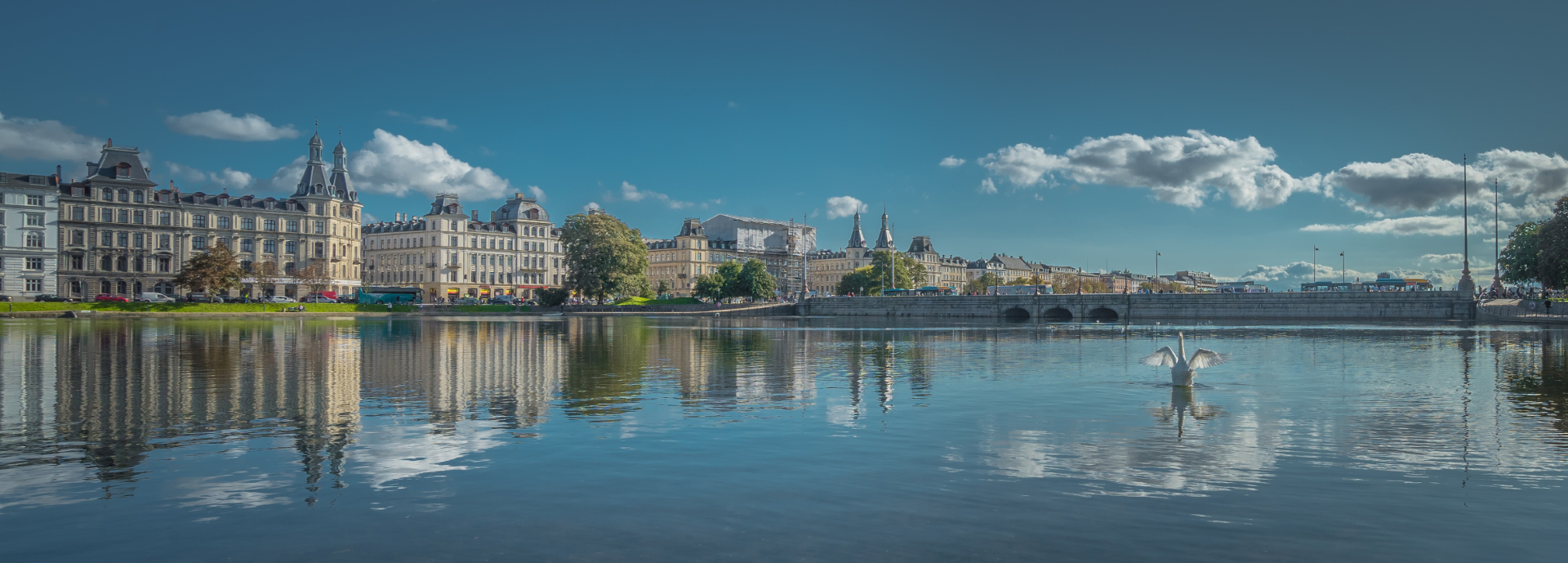 The next image is a low-light shot also using the new lens. Here too I'm very happy with the sharpness. Any non-sharpness is due to it being a very windy evening. Low-light was my big problem with my old camera and old lenses. You couldn't see where a blade of grass started and ended. It was all just an indistinct mess. Much better here, in my own opinion.
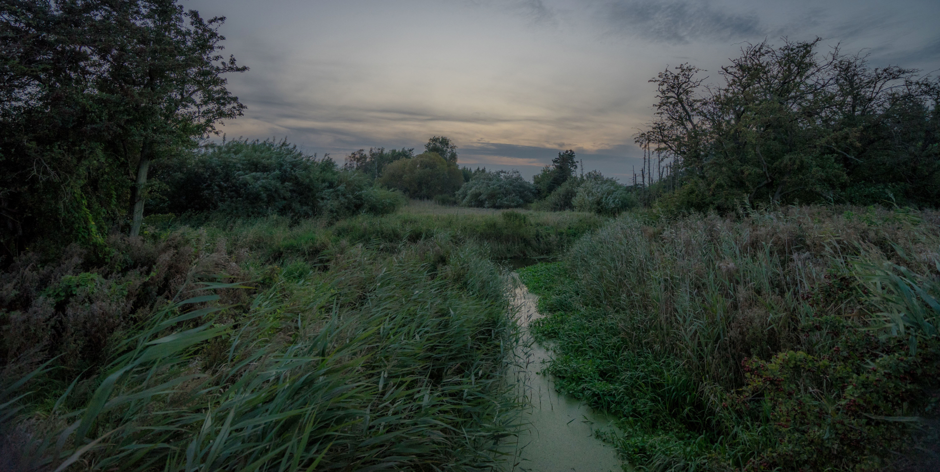 So while my new lens is the most important reason my photography has taken a turn for the better, there are other reasons, reasons that actually have more to do with post-processing than shooting.
About a month ago, I finally lost patience with my old laptop that I normally used for photo editing. It was slow, constantly died from BSOD, and it was running out of disk space. At the same time, the price dropped on a laptop I'd had my eye on that would be a gigantic step up for me. So, I convinced myself I'd just saved a lot of money by not having to buy a wide angle lens and hit the "buy" button.
And what a difference it has made. Never mind how fast it is and that it has made Lightroom a breeze to run, the screen has made me realize that for all these years, I've been doing my post-editing all wrong. Looking at my pictures that were edited on my old computer, I see how awful they look. Way too much contrast, too much black, too much clarity. So, no wonder I'm not a rich and famous photographer! My pictures were ugly! That changes now.
Last... and maybe least, but it still deserves a mention: a brand new piece of photo editing software has given certain pictures the last oomph that really make them stand out. It's called Luminar and still only exists in a beta version for Windows (I think a fully developed version exists for Mac). While I love Lightroom and have no plans to abandon it, it's mostly suited for - and this may be due to my lack of skills in using it - a nice and proper result. Nothing wrong with that. But it takes more than that to get attention. Especially when you don't live near waterfalls, mountains, volcanoes, rivers, wild oceans, or whatever else will give you a natural advantage in photo contests such as the ones I frequent at ViewBug and GuruShots.
So here's a before and after example of a plain Lightroom edit and a Lighroom edit enhanced by Luminar. The first image is probably closer to "real life" than the second, but real life usually won't win you many "wow"'s and "oohh"'s.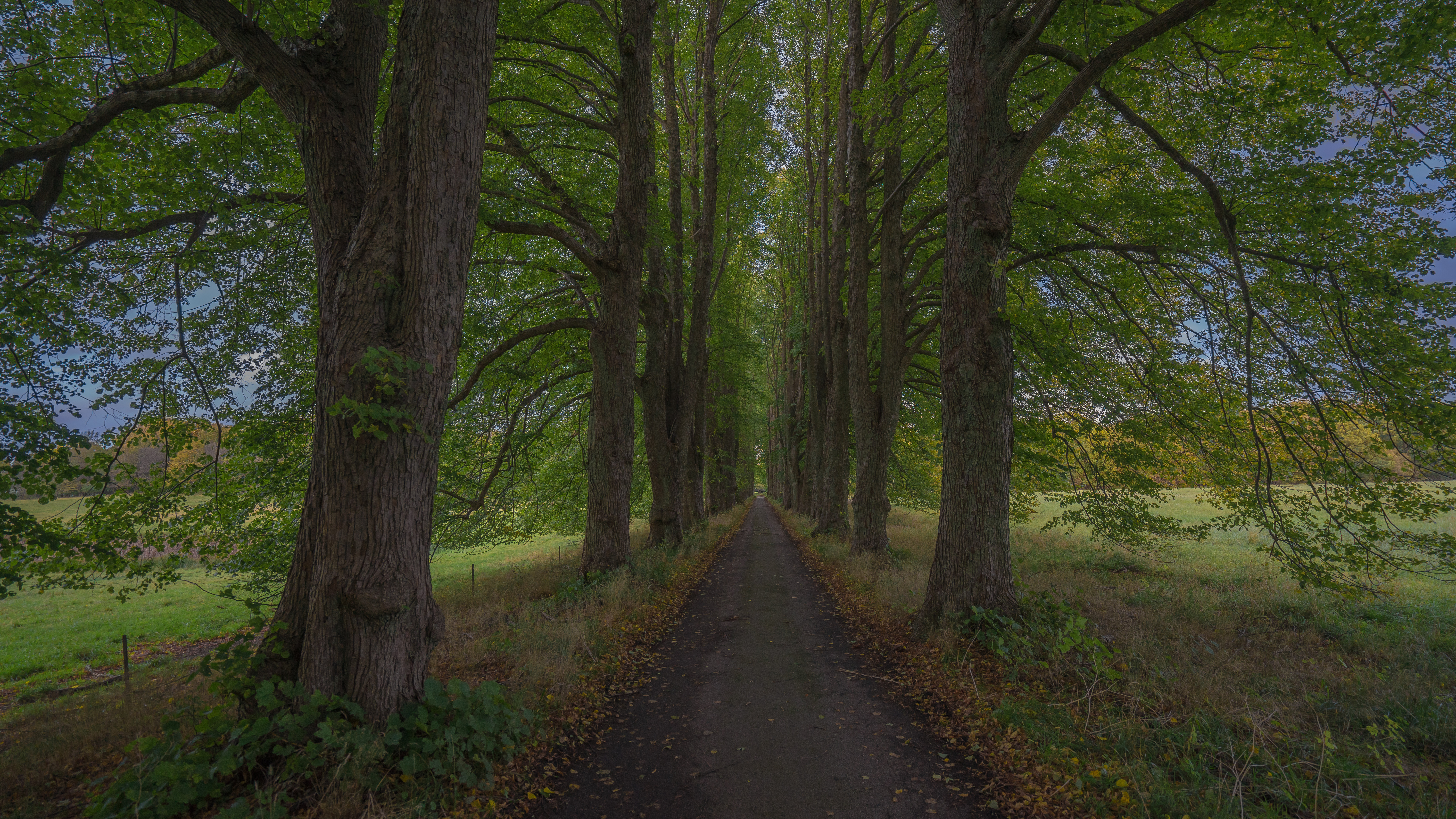
 And just for the record, I don't post-process my images based on what I think will win contests (I won't win any contests, anyway), but mostly based on my own tastes. So, yeah, I prefer to look at the Luminar version, too, just like the majority of contest voters.
So, agree or not, in my own mind my photography is improving and that's really another reason I want to go out there and shoot - even if it's the same things I shoot over and over. It's invaluable practice for when I finally go to the really great locations.
... but that doesn't mean a photo can't be. I mean, I have personally been skeptical of black and white photography. If color photography had been invented first, would anyone have ever thought about black and white? I doubt it.
But lately I have come to appreciate the art of black and white photography and have turned more and more of my own pictures into black and white shots. What happened was that I realized black and white wasn't just black and white. Black and white can have as many different expressions as color photography. I discovered this when I installed Google's Nik Collection after Google started to offer this otherwise expensive software for free. Apart from well-known post-processing tools such as noise-reduction and sharpening, Nik Collection includes a tool called Silver Effect Pro that is basically an advanced black and white converter. And you don't even have to use the advanced options. The presets are usually enough to blow my mind and do the job for me.
So below are some of my own favorite black and white shots, all made using Silver Effect Pro, and with a feeble attempt to explain what, in my opinion, makes them work in black and white.
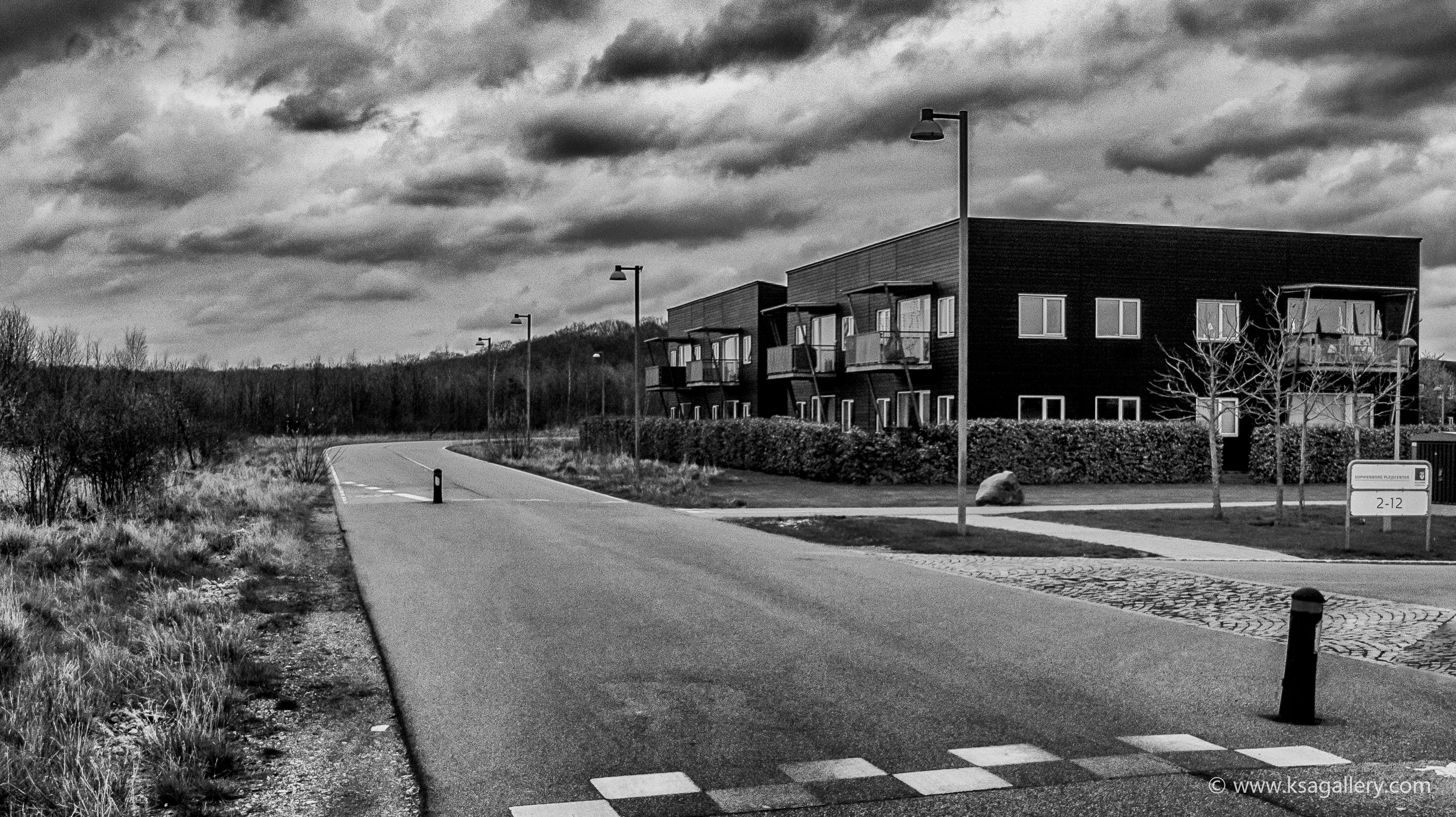
I think this was the picture that opened my eyes to the power of black and white. In color, a rather bleh image of a neighborhood development, in black and white... something, to me, much more powerful.
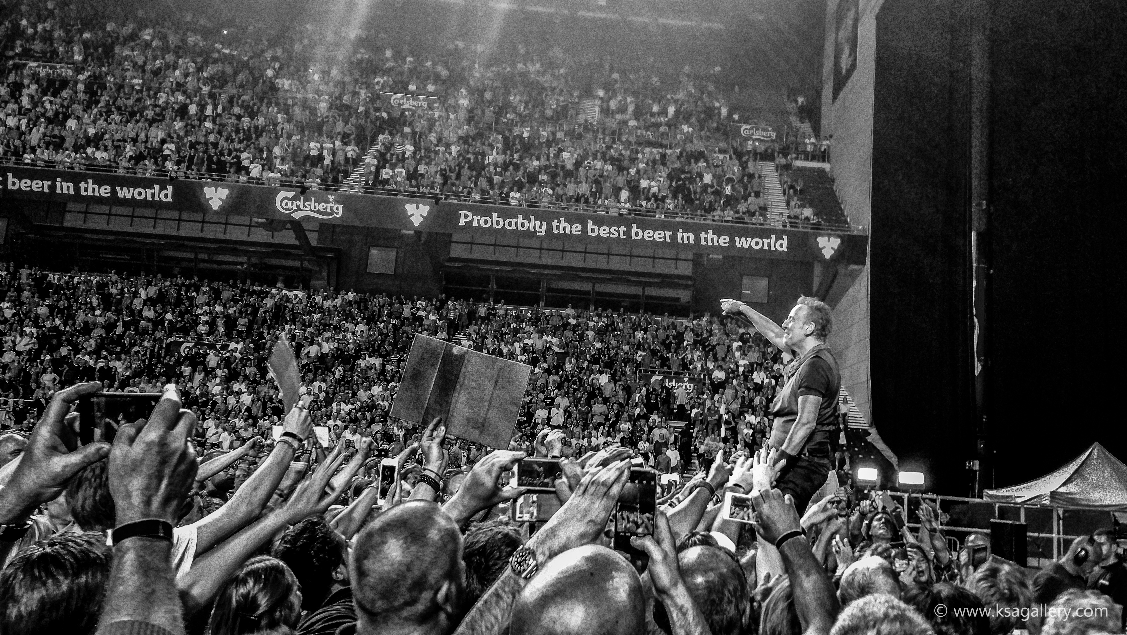
A picture I took at a Bruce Springsteen concert in Copenhagen in 2016. In this case, I think the black and white style makes an otherwise very detailed image more soothing for the brain.

This abandoned cabin in Montana was a slam-dunk, I thought. But I just couldn't get it right in post-processing due to the colors just being completely uninteresting. So what do you do? Remove the colors, of course. That hit the nail on the head.
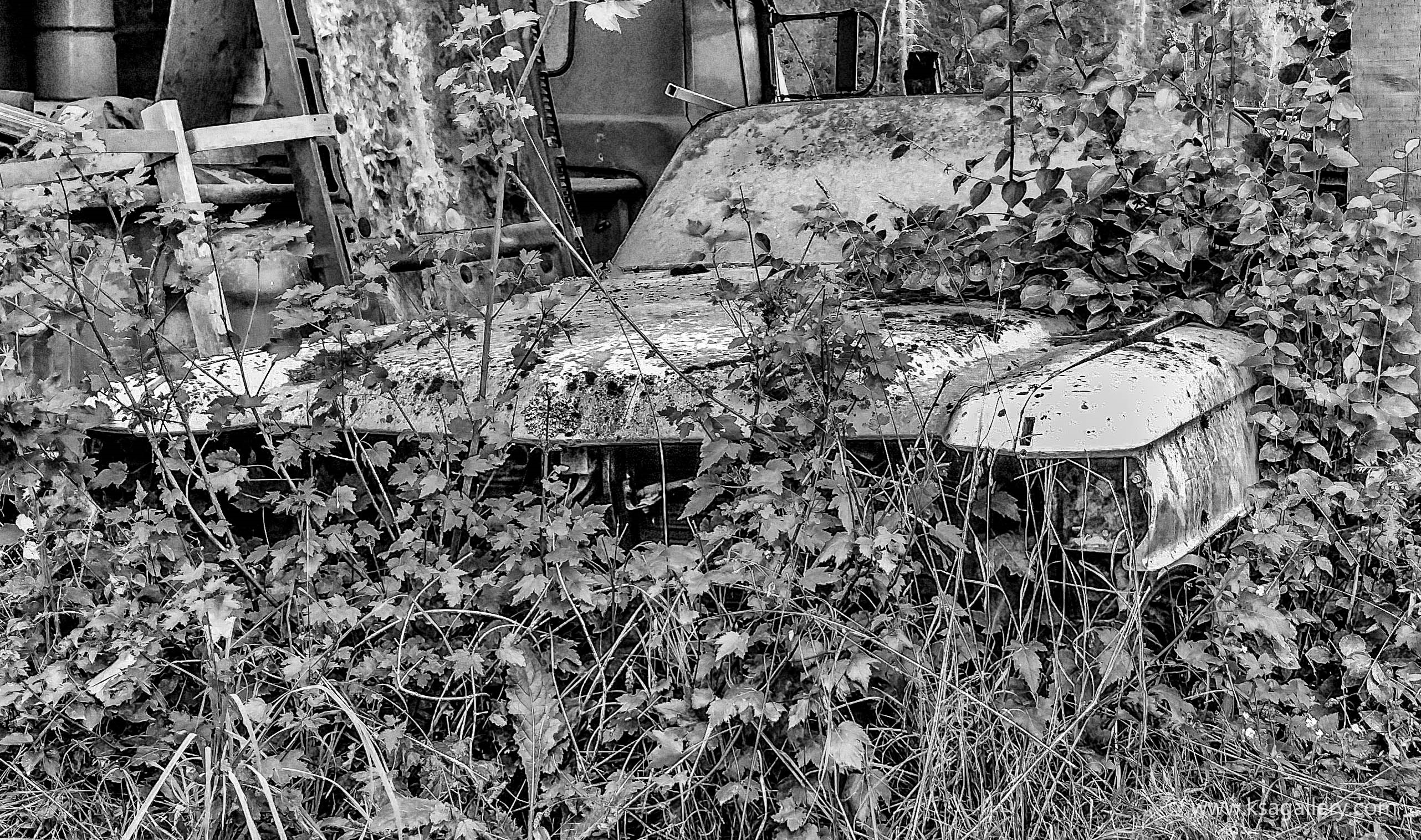
The black and white here helped erase the difference between the car and nature and thus emphasizing nature reclaiming its materials. I could never have done that in color.
Another example of a picture that just didn't work very well in color, because the colors were just kind of blah. Still not for everyone I guess, but I like it.
I posted a color version of this in my "Best of November" post, but I actually think it works even better in black and white. Technically and artistically one I'm rather proud of.
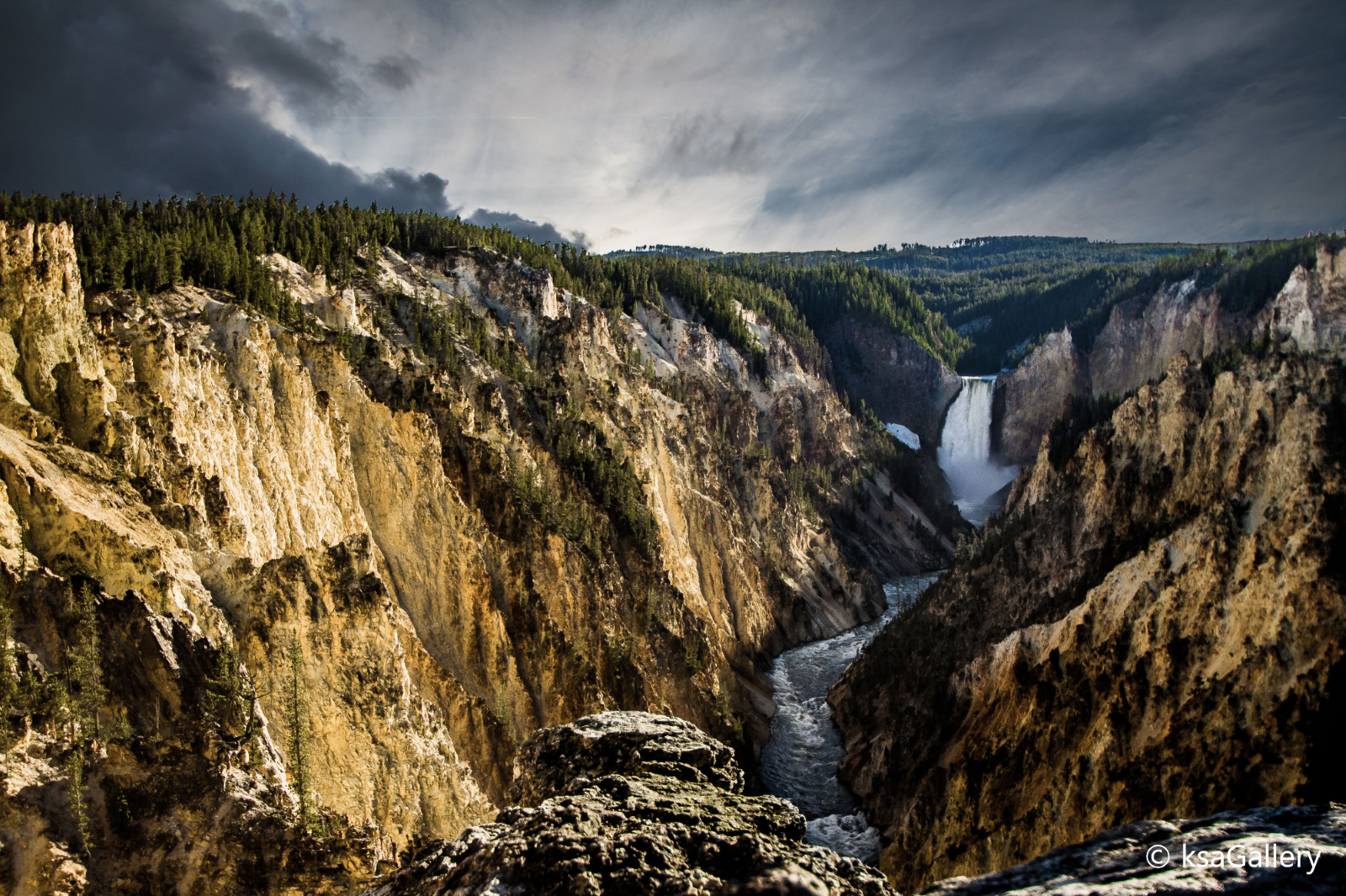
Lower Falls in Yellowstone National Park must be one of the most beautiful landscape sceneries you can lay your eyes on. I remember the first time we visited it back in 2003, I literally started crying. It was that overwhelming. I think it's impossible to take a bad picture of it (still, that doesn't mean you should just point a crappy cell phone camera at it and push the button.... it deserves so much more than that).
And yet, after our latest visit there in 2014, my first time in Yellowstone with a DSLR camera, I just wasn't happy with the result. I took dozens of pictures, even using a tripod, and while none of them were bad - because, like I said, it's impossible to take a bad picture there - they just didn't do the place justice either. Mostly it was the light. It was in the late afternoon, and the sun was still high in the sky and at a bad angle, creating a hard light unsuited for photography.
Recently I decided that another factor was the sky. It was just a plain blue sky with a few white clouds thrown in. No drama. No colors. Just a bland postcard blue sky. Yawn!
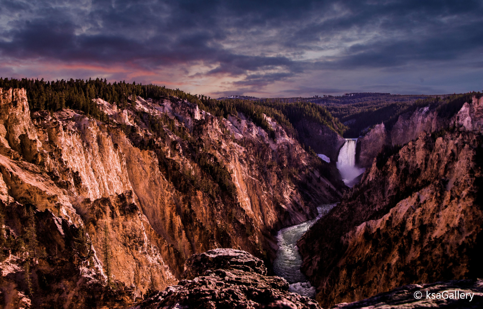
So what if I could change those two factors? Well, thanks to Photoshop, I could, and I did, as you can see. But isn't that cheating? That depends on what your goal is. If your goal is to make an exact representation of reality, then yes. But if your goal is to create a beautiful, evocative piece of art, there's nothing wrong with doing whatever you want to achieve that. Whether I was successful is up to the viewer, but I'm happy enough with the result that I think I can finally stop beating myself up over what I could have done differently to perfect what should have been a slam dunk.
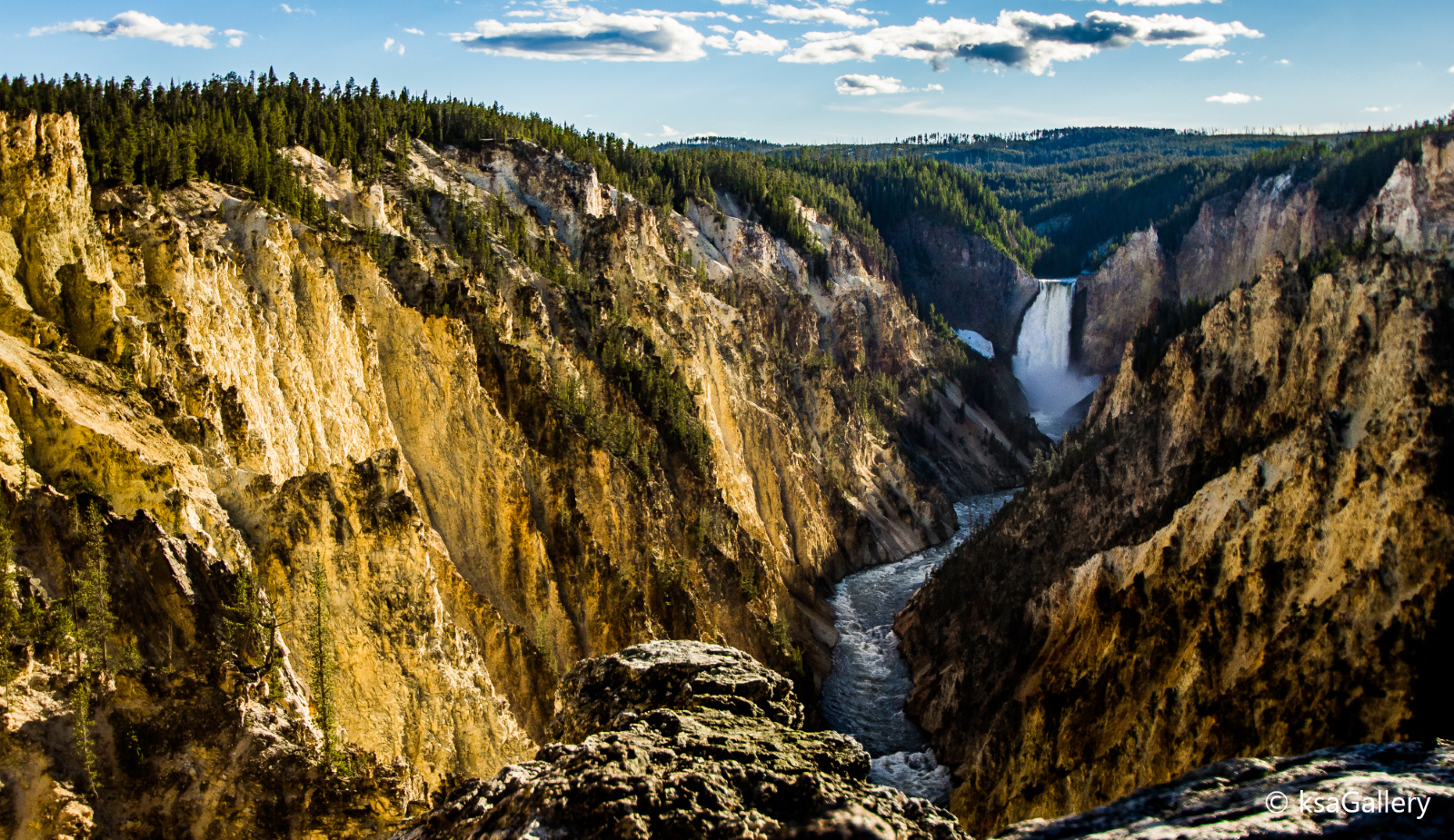 This is the "original" picture, as in, this is kind of what it really looked like. The picture has been enhanced, but these were the colors and those were the clouds. And I wasn't completely happy with it.
 "Dramatic clouds" version with the clouds complementing the waterfall.
 The "sunset version", again with the clouds fetched from another picture.
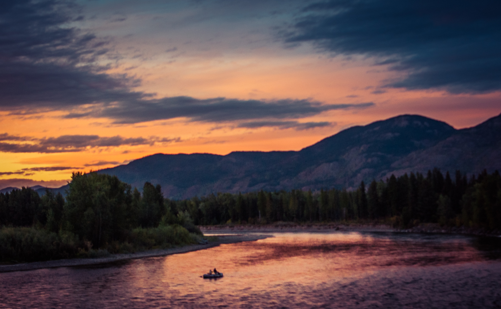
We were heading back to our hotel after a long, exhausting day in Glacier National Park. Just before entering the town of Columbia Falls, where we were staying, we drove across a bridge over the Flathead River. It's the kind of bridge where you hardly notice you are on a bridge. The road just goes a little uphill and then a little downhill - it's over in 10 seconds - and if you don't happen to look to the sides, you might have thought it was just a small hill.
Fortunately, on that night I did look to the side, and what I saw was one of the most magical sights I'd ever seen. The sun had gone down, but some light still remained. An orange glow on the far horizon where the sun had recently disappeared, gradually, and with the help of a few high clouds, turned purple, leaving a magical pink reflection on the river. And right smack in the middle of the river a lonely canoe floated silently toward the bridge carrying two people.
This was not the kind of bridge where you could just stop in the middle and get out and take a picture. If I wanted a picture, it had to be right there, that instant, and out through the side window of the moving car.
Fortunately, the camera was already in my hand so all I had to do was raise it, point, and shoot. That's all there was time for. I managed to get two shots off within a couple of seconds. Then the scene disappeared behind us.
Well, not that I had the highest expectations, but you can imagine my disappointment when I later looked at the pictures and the best of the two had turned out like this:

That was hardly what I had seen with my own eyes. Still, I had hope. While I knew that this would never be the technically best picture I'd ever taken or anywhere near sharp, I thought that I could probably improve it enough to make it decent.
Well, I will let you be the judge now, but this is the result after quite a bit of work in Lightroom. Obviously, the horizon has been straightened, the colors have been emphasized, highlights down, shadows up, and I made it as sharp as I could without making it grainy. I was personally very happy with just how much I was able to improve it considering it was taken out the side window of a car moving at 50 kilometers an hour.
The next night I made sure we returned to the spot around the same time hoping there would be more time to take a better picture. But the light was nowhere near as good, and despite spending around an hour there, I didn't take a single picture that was worth showing off.
So, the moral of the story? Well, if the choice is between shooting a crappy picture and not shooting at all, shoot the crappy picture. You might just be able to save it.